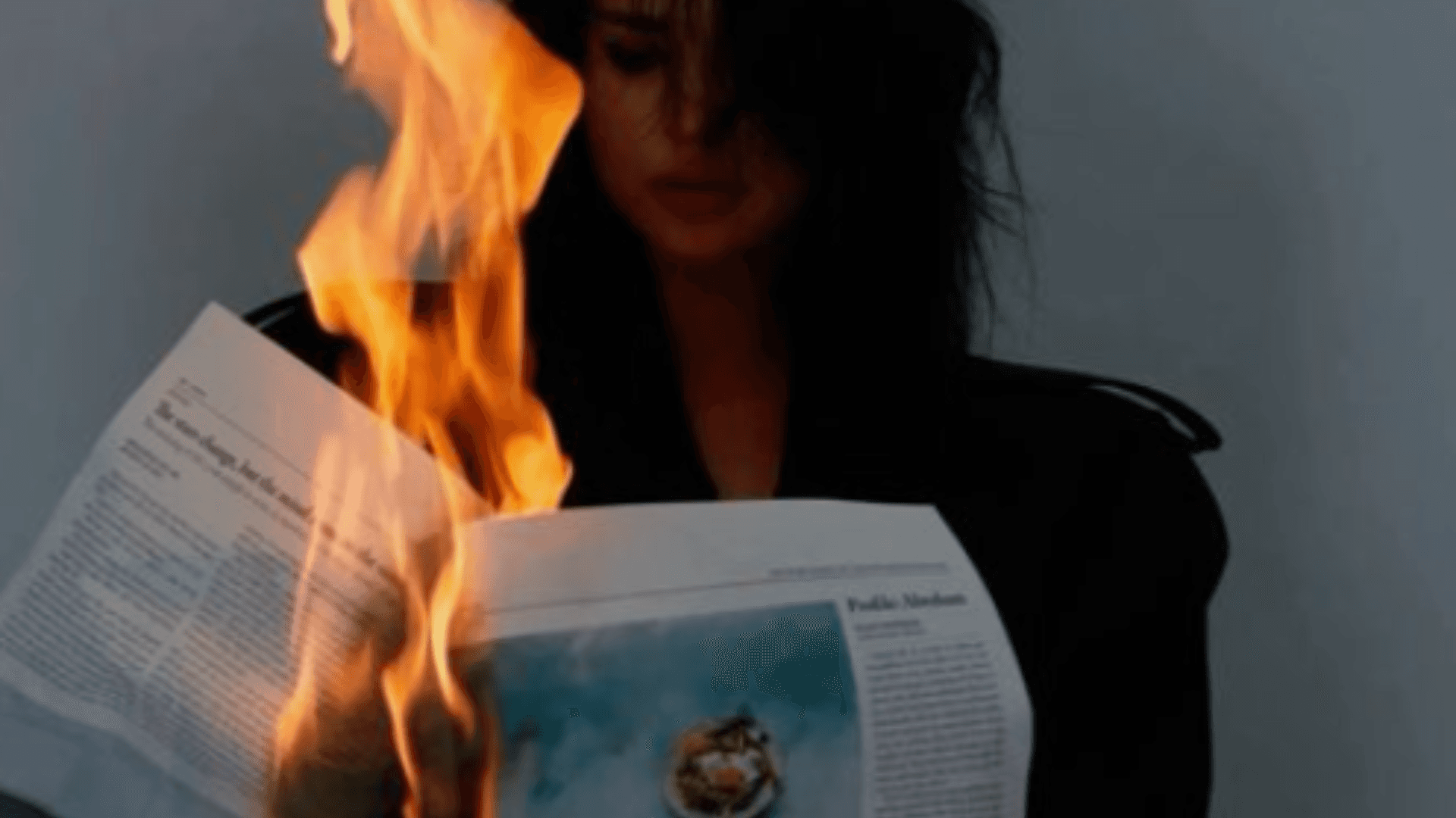
A HANDY GUIDE TO BECOMING COMPLETELY FORGETTABLE.
Building a distinctive brand takes thought, consistency and a clear understanding of who you are trying to reach.
Burning one is considerably easier.
Ignore the strategy. Follow every trend. Change your style whenever you get bored and make every decision according to your own personal taste. Before long, your customers won’t know who you are—and neither will you.
If becoming completely forgettable is the goal, here are ten dependable ways to burn your brand.
01 — LET AI DESIGN YOUR POSTERS
BECAUSE NOTHING SAYS “YOUR BRAND” LIKE LOOKING LIKE EVERYONE ELSE.
AI can be a useful creative tool. It can help generate ideas, explore imagery and speed up parts of the design process—but it cannot replace original thinking, brand strategy or art direction.
When businesses rely on generated posters without a recognisable visual identity behind them, the results quickly begin to look the same. Similar compositions, similar imagery and the same polished-but-empty finish.
The problem isn’t using AI. The problem is allowing it to make every creative decision for you.
A strong graphic designer uses the right tools to communicate a specific idea. The tool should support the brand—not become the brand.
HOW TO AVOID IT:
Start with a clear concept and established visual identity. Use AI selectively and art-direct the output so it genuinely belongs to your business.
02 — TRY TO SAY EVERYTHING
WHEN EVERYTHING IS IMPORTANT, NOTHING FEELS IMPORTANT.
Your business has a lot to offer, so naturally you want to tell people all of it.
Every service. Every benefit. Every detail. Every reason to choose you—all competing for attention in the same advert, website section or social post.
The result is rarely informative. It is overwhelming.
Effective brand communication creates a clear hierarchy. It identifies the most important message, communicates it confidently and gives everything else the space to follow.
Strong brands know what to say, when to say it and—just as importantly—what to leave out.
HOW TO AVOID IT:
Decide on one objective for each piece of communication. Lead with the message that matters most and remove anything that distracts from it.
03 — DESIGN FOR YOURSELF
YOUR PERSONAL TASTE ISN’T THE BRIEF.
THE BRAND NEEDS TO CONNECT WITH THE PEOPLE YOU’RE TRYING TO REACH.
You might hate yellow. You might love handwritten fonts. You may personally prefer everything to be clean, minimal and black.
None of that automatically makes it right for the brand.
Good brand identity design isn’t based entirely on the personal taste of the business owner or designer. It is shaped by the organisation’s strategy, positioning, personality and audience.
That doesn’t mean you should dislike your own identity. It means every design decision needs a stronger reason than “I like it.”
HOW TO AVOID IT:
Return to the strategy. Ask whether the design reflects the business, communicates the right personality and connects with the intended audience.
04 — CHASE EVERY TREND
TRENDS CAN MAKE YOU LOOK CURRENT.
THEY CAN’T TELL YOU WHO YOU ARE.
Following a trend can make a brand feel relevant for a moment. Building the entire identity around it can make the same brand feel dated just as quickly.
When every business adopts the same typography, colour palette, illustration style or AI-generated aesthetic, distinctiveness disappears.
A strong brand can respond to culture without allowing every passing trend to redefine it. Its core identity remains recognisable even as individual campaigns and content evolve.
HOW TO AVOID IT:
Create a timeless foundation and use trends selectively. If an idea doesn’t support the brand’s personality or strategy, leave it alone.
05 — CHANGE YOUR LOOK EVERY WEEK
BECAUSE CONSISTENCY IS BORING.
One week the brand is clean and sophisticated. The next it is loud, rebellious and covered in distressed graphics. By Friday, everything has changed again because somebody found a new Canva template.
Constant experimentation might feel creative internally, but externally it makes the business difficult to recognise.
Consistency doesn’t mean making everything identical. It means using a familiar visual language—colours, typography, imagery, layouts and tone of voice—so different pieces of communication still feel like they came from the same brand.
Recognition is built through repetition.
HOW TO AVOID IT:
Develop clear brand guidelines and a flexible design system. Give the brand enough variety to remain interesting without losing the elements that make it recognisable.
06 — COPY YOUR COMPETITORS
IF IT WORKS FOR THEM, STEAL IT.
It is sensible to understand your competitors. It is less sensible to become indistinguishable from them.
Copying the colours, messaging and visual style already dominating your industry might make the business look familiar—but it also removes any reason to remember it.
Competitor research should help identify opportunities. If every rival looks and sounds the same, that is a gap your brand can use.
Distinctive branding doesn’t ignore the market. It understands the market well enough to avoid disappearing into it.
HOW TO AVOID IT:
Analyse what competitors are doing, find the conventions everyone follows and decide where your business can credibly do something different.
07 — TREAT YOUR LOGO AS THE ENTIRE BRAND
STRATEGY. VOICE. EXPERIENCE. WHO NEEDS THEM?
Your logo is an important identifier, but it is not the complete brand.
A brand also includes your positioning, messaging, typography, colours, imagery, website, customer experience and the way your business behaves.
Even brilliant logo design cannot compensate for unclear communication, inconsistent visuals or a poor customer experience. Sticking a logo onto everything doesn’t create a coherent identity if none of the surrounding elements work together.
HOW TO AVOID IT:
Build a complete brand system around the logo. Define how the business should look, sound and behave across every customer touchpoint.
08 — USE EVERY FONT YOU LIKE
MORE FONTS MEANS MORE PERSONALITY.
Typography plays a major role in how a brand feels. It can make a business appear confident, approachable, rebellious, traditional or highly technical before anyone reads a word.
Using too many unrelated typefaces removes that clarity. Instead of creating personality, they compete for attention and weaken the visual hierarchy.
A considered typography system normally needs far less than people think. What matters is how consistently and intelligently those typefaces are used.
HOW TO AVOID IT:
Choose a focused type system with defined roles for headlines, supporting copy and body text. Establish clear rules for size, weight, spacing and hierarchy.
09 — MAKE YOUR WEBSITE LOOK LIKE EVERYONE ELSE’S
SAME TEMPLATE. SAME STOCK PHOTOS. SAME EMPTY WORDS.
Your website functions. So does a toilet.
A functional website is only the starting point. It also needs to communicate who you are, explain why you are different and guide visitors towards taking action.
The platform isn’t what makes a website generic. Framer, Squarespace, WordPress and other website builders are simply tools. The problem comes from using those tools without strategy, distinctive design or meaningful content.
A strong website should feel like a natural extension of the brand—not a template with the logo dropped into the corner.
HOW TO AVOID IT:
Build the website around your brand, audience and objectives. Combine clear messaging with distinctive website design and an experience that makes the next step obvious.
10 — NEVER CHANGE ANYTHING
YOUR BUSINESS HAS EVOLVED. YOUR BRAND SHOULDN’T.
Consistency is important, but consistency should not become stagnation.
Businesses grow. Audiences change. Services develop and markets move forward. The identity that worked five years ago may no longer reflect the organisation you have become.
That doesn’t mean following every trend or rebranding every twelve months. It means recognising when the gap between the business and its identity has become impossible to ignore.
The best rebrands retain what remains valuable while creating the clarity and flexibility needed for the next stage.
HOW TO AVOID IT:
Review your branding regularly. If it no longer represents the quality, direction or ambition of the business, evolve it with purpose rather than changing it for the sake of change.
DON’T JUST LOOK PROFESSIONAL.
BECOME RECOGNISABLE.
A strong brand is more than something that looks good. It creates clarity, builds familiarity and gives people a reason to remember one business over another.
That requires strategy, original thinking and consistent application—not simply another logo, template or collection of disconnected graphics.
Studio Amore is an independent branding and graphic design studio in Warrington, Cheshire. We create distinctive brand identities, logo design, websites and creative campaigns for businesses across Cheshire and the UK that don’t want to blend in.
If your current branding feels inconsistent, forgettable or no longer reflects the business you have become, let’s rebuild it with intent.
READY TO STOP BLENDING IN?
START A PROJECT →
