Services
Art Direction, Poster Design
Client
Personal Project
Year
2026
A personal poster project reinterpreting some of cinema’s most recognisable films through a single, cohesive visual system.
I’ve always loved the James Bond films, but their iconic title sequences and poster artwork were just as influential as the films themselves. They played a part in inspiring my own journey into design, and I had always wanted to create a Bond poster series of my own.
Rather than replicate the original artwork, I wanted to build something distinctive that could work across different eras, actors and stories while still feeling unmistakably Bond.
Every Bond film comes with its own visual language, memorable characters and defining moments. The challenge was finding a consistent structure that could unite them without making every design feel the same.
The posters needed to reference each film clearly, reward fans who recognised the details and still function as strong standalone pieces of graphic design.
The playing card became the foundation of the series—a simple device connecting Bond’s world of casinos, risk, chance and deception.
Each film was assigned its own card, colour palette and collection of visual references. Concentric target rings create consistency across the series, while distressed textures, bold typography and limited colour give the artwork the character of vintage screen-printed film posters.
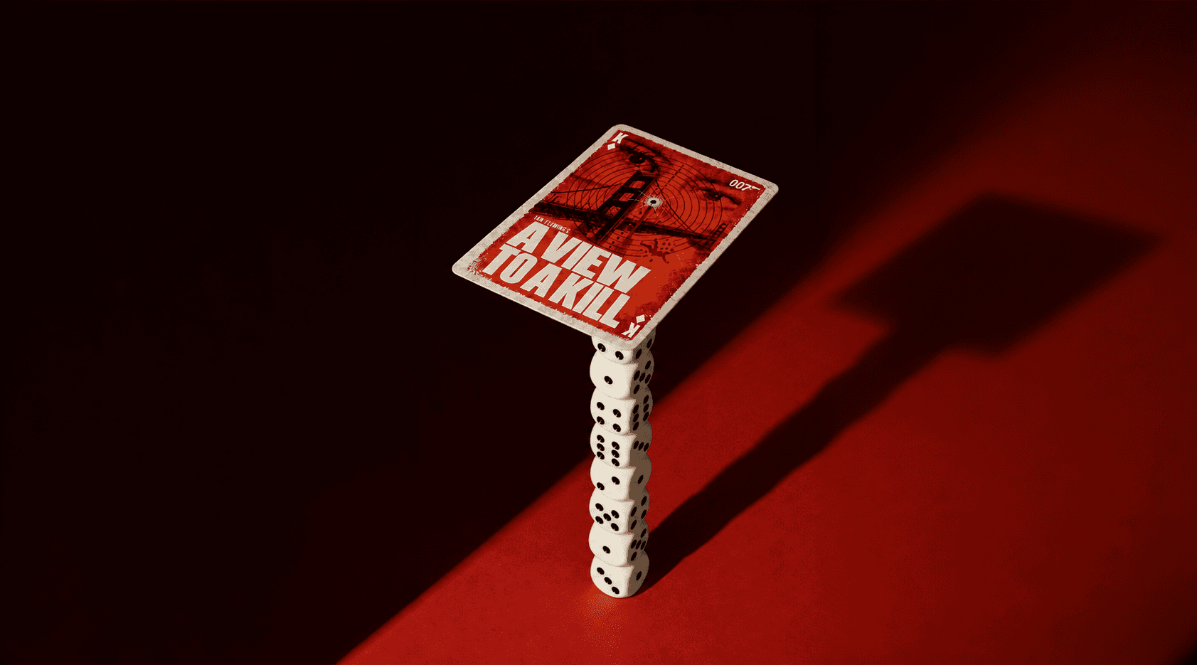
Halftone portraits loom behind the targets, while silhouettes and objects reference defining moments from each story: the Goldfinger laser table, the Golden Gate Bridge in A View to a Kill, Tracy and the ski chase in On Her Majesty’s Secret Service, and Vesper watching over the action in Casino Royale.
The cards were then placed into cinematic editorial environments using casino tables, poker chips, dice, a martini glass and Goldfinger’s bowler hat. This helped transform the designs from individual posters into a more complete and ownable visual world.
The final collection brings together films from different Bond eras through one recognisable design system.
Each card tells its own story, but the repeated targets, typography, playing-card details and distressed finish make the posters feel like part of the same deck. The accompanying editorial imagery expands the idea beyond flat artwork and gives the project the atmosphere of a complete campaign.
It’s a personal tribute to the films and poster artwork that first made me want to create—and an opportunity to finally put my own design language into the world of James Bond.